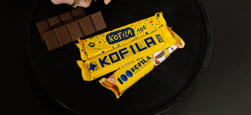
Graphic Design students designed the packaging for Kofila
30. January 2023On the occasion of the 100th anniversary celebration, the Czech stick KOFILA has given itself a design edition, which was created in cooperation with our Graphic Design studio. KOFILA inspired young artists to create an original packaging for the bar – students designed almost 80 unique designs, from which 7 of the most interesting were selected and went into production.
The students were inspired in their designs not only by the combination of a typical element of KOFILA, which is coffee and chocolate, but also by the original design by Zdenek Rykr or patterns that were popular at the time KOFILA was created. The designs were selected by an expert jury composed of:
- Pavel Noga, head of the Graphic Design studio at Tomáš Bata University in Zlín
- Štěpánka Koutná, creative director of the Yellow Shapes graphic studio
- Lumir Kajnar, a well-known designer and graduate of the Tomáš Bata University in Zlín
- Stanislava Růžičková, business manager of the confectionery division
- Eliška Soukupová, KOFILA brand manager
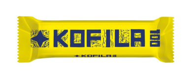
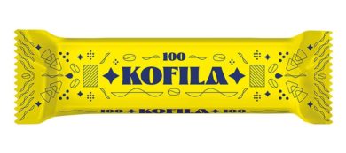
Ivan Večerk’s design, which clearly communicates the KOFILA brand together with the Orion star and the number 100 referring to the anniversary, was evaluated as the best and was realized in the form of a linocut.
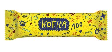
The second best design was the hand-illustrated design by Lucie Nguyen, which shows various associations to the stick and together form a simple graphic unit, dominated by the illustrated inscription KOFILA.
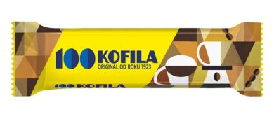
The third best design is a geometric illustration by Izabela Princová, in which mugs with coffee are incorporated and the number 100 is made of coffee beans.
The other four proposals that appealed the most to the jury were as follows:
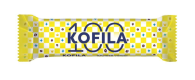
Viktoria Faber’s design, in which the main motif is a chessboard and the players are coffee beans, Orion stars or royal crowns. The chessboard is dominated by the inscription KOFILA, which is located between the number 100.
When preparing her design, Markéta Myšková was inspired by art nouveau patterns from the 20s of the last century, which were popular at the time when KOFILA saw the light of day. The content includes illustrations referring to both coffee – coffee bean, drop, filters or steam – and chocolate.
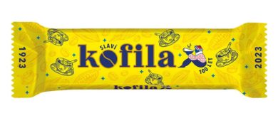
The design by Lucie Trojanová preserves the visual form of the existing design, which the author supplemented with drawings of cocoa beans, coffee beans and a cup of coffee. Her design refers to the fact that the bar contains real coffee, the letter “o” in the name KOFILA is meant to imitate a coffee bean, and the whole design is also complemented by dates referring to the 100th anniversary.
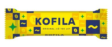
The design by Ferdinand Kacler refers to Rykr’s original motifs. However, these are abstracted in the design, which creates a new modernist concept of the design of the iconic KOFILA stick.
There are symbolically seven design editions, just as there are seven days in a week. For the 100-year anniversary, the brand created a special communication campaign that people will encounter during February not only on television, but will also have an impact on social media with the use of influencers, so the work of our students will become known to a wide audience.